The default trap
I've been looking at websites built on Lovable, Bolt, Manus and the other AI website tools. They're getting really good. A year ago I'd have said they all kind of look the same. That's still partly true, but it's becoming more interesting than that.
Open Lovable's own showcase directory, Made with Lovable, and the default pattern lands quickly. Gradient hero. Pill-shaped buttons. Card grids in three columns. Testimonial carousels with circular avatar headshots. The same particular spacing rhythm running down every page. Take SEO Signpost. The live site hits every cue without scrolling. It's a real default.
But "they all look the same" overstates it now. You can prompt around it. The tool makers are also designing around it. And the gap between a generic AI-built site and a good one is closing.
This edition is about what changed, what hasn't, and what's still on you.
Why the default exists in the first place
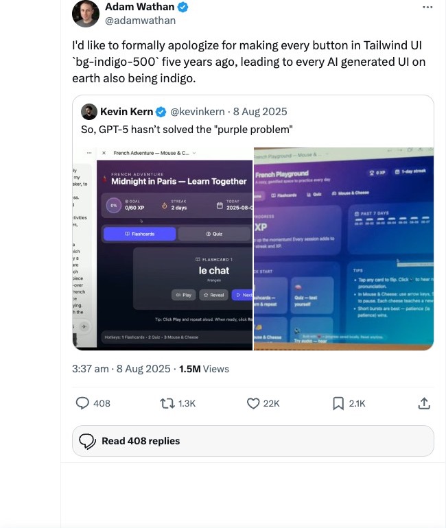
The models powering these tools are trained on web design data scraped from the open internet. When you ask one for "a website for a plumbing business" without much else, it reaches for the version it's seen most often. Hero with a strong photo. Three-up service cards. Why-choose-us section. Trusted-by logos. Footer with quick links. And that one particular shade of indigo-blue.
There's a specific reason for the indigo. Five years ago when Tailwind CSS launched its component library, the team needed a default colour for the button examples in their documentation. They picked `bg-indigo-500`. Nothing wrong with the choice. It had to be something, and indigo worked across the examples. But then every tutorial, every demo, every developer documentation page leaned on those same Tailwind components with that same indigo default. All of that ended up in the training data for the AI models behind today's website tools. So now every AI-generated website ships with a purple-blue accent. Adam Wathan, the creator of Tailwind, has publicly apologised for it. His exact words: "I'd like to formally apologize for making every button in Tailwind UI `bg-indigo-500` five years ago, leading to every AI generated UI on earth also being indigo."
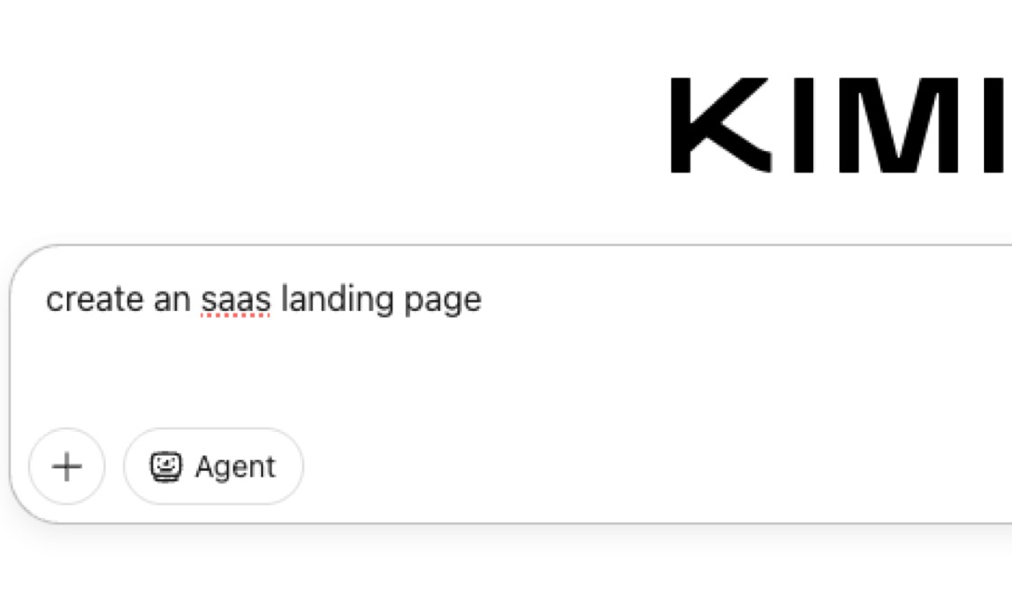
You can still watch the default happen in real time. Ask Kimi, an AI chat tool similar to ChatGPT, for an SaaS landing page today and the Tailwind config it generates leads with `Inter` as the sans-serif and a primary palette starting at `#3b82f6` blue-500. The pattern is in the literal code.
That's not a bug. It's just default. And without a specific brief, default is what you get.
What's being done about it
A few things at once. The tool makers see the problem.
Anthropic shipped Claude Design in April. The interesting bit isn't that it generates designs. Most tools do that. The interesting bit is that it reads your codebase and your design files first and builds a design system from them. Then every project after that uses your colours, your typography, your components automatically. The brief, baked in.
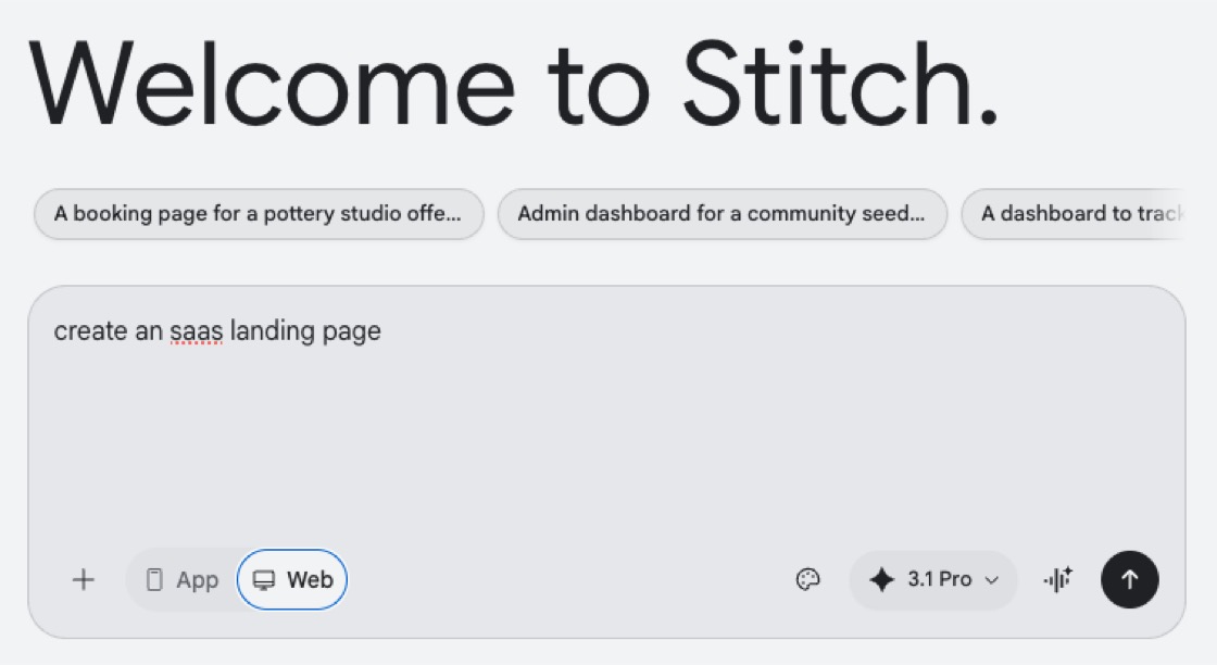
Google's own design tool, Stitch, lands on the same idea from a different angle. It uses a `design.md` file that stores your brand's colour palette, fonts, and styling rules. Every UI it generates reads from that file.
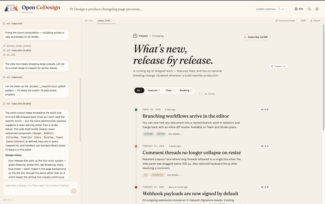
The open-source community is building alternatives too. Open CoDesign on GitHub names the problem directly: "Generic AI tools tend to produce generic output." Their fix is a "built-in taste layer" that, per the README, "steers the model toward considered typography, purposeful whitespace, and meaningful color."
Three different tools, same idea. Design-system-as-input. You don't tell the model what your business does and ask it to make something nice. You tell it what your business looks like and ask it to compose against that. The trap loosens.
The training is shifting too. Anthropic ships an instruction set with Claude that bans clichés directly when generating frontend code. The line: "cliched color schemes, particularly purple gradients on white backgrounds." Predictable layouts. Cookie-cutter design. The trainers know the trap and are training around it.
That's real progress. It's not the whole answer.
What design-system-as-input doesn't fix
Open CoDesign ships with twelve built-in design skill modules. Slide decks, dashboards, landing pages, SVG charts, glassmorphism, editorial typography, heroes, pricing, footers, chat UIs, data tables, calendars. That's a more sophisticated menu than what Lovable defaults to. It's still a menu.
If everyone using Open CoDesign picks from the same twelve modules, every site built on it will share DNA with every other site built on it. Better DNA than the Lovable default, sure. But still shared.
The bit that doesn't compress into the toolset is taste. Knowing when the default hero is wrong for this business. Knowing the photo of the actual owner standing in the actual workshop beats any image the model could generate. Knowing what to leave out.
Someone still has to push back. The AI doesn't know that this particular plumber has thirty years of experience that ought to anchor the page until you tell it.
A quick demo, and the real work
Two things I want to show you. Both involve AI tools, both push back against the default. They sit at different points on the dial.
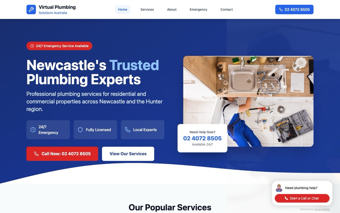
Earlier this year I ran a test on Bolt.new. What could it do for "a plumbing business website" with a bit of steering? The result is at plumbing.jezweb.ai. Navy and red, not indigo. An overhead photo of a plumber under a kitchen sink, not a generic illustration. Three concrete trust badges (24/7 Emergency, Fully Licensed, Local Experts) instead of "Why Choose Us." A real phone number front and centre, wired through to an ElevenLabs voice agent. A chatbot widget in the corner running on the same voice agent. It's not a real plumbing business. I built it as a demo, partly to find Bolt.new's ceiling with some direction, partly to show what a working chat-and-voice agent integration looks like on a plausible site. Bolt.new can do that. It defaults to the SaaS template if you don't push, but with modest direction it can land somewhere else.
The real client work happens differently.
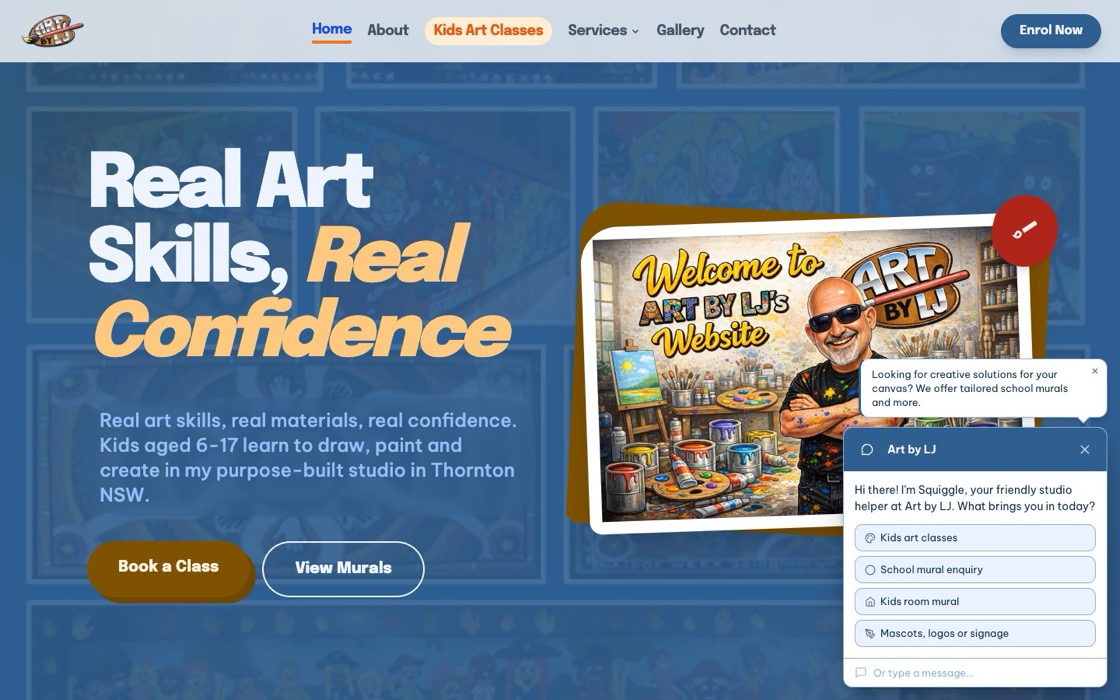
Art by LJ is Lex James, a Hunter Valley artist running art classes, murals, and signage. We built this site with Claude Code, with Lex steering hard. He supplied the logo, the hand-drawn caricature, the student artwork, the custom "Real Art Skills, Real Confidence" lettering, the page list he wanted, and the words. The model composed against his material, not its own defaults. Real ABN in the footer, the actual phone number on the home page. Over thirty years painting and drawing, twelve-plus years running classes. A site this specific only exists because Lex showed up with specific stuff.
The three Lodge sites featured below (Alfred, Jesmond, and William) were also built with Claude Code, for one client (Tony Hughes of Newcastle Apartments) as an intentional style-set.
Different tools, different surface, different level of direction. The pattern that holds across all of them: the more creative input you put in, the further the output gets from the default. Bolt.new with light steering escapes the indigo trap. Claude Code with full direction produces work that wouldn't exist without you. The next jezweb.com.au will be built the same way.
We use AI tools throughout the build. Stitch handles initial design exploration. Gemini and GPT generate some images and critique each page before it ships, though neither can do accurate location shots yet. But the brief is human. The taste is human. The decision about what photo to use, what local landmark to name, how to talk to a hospital nurse versus a uni student. That's the part that doesn't come from a model default.
What to do if you're using these tools
If you're using Lovable or Bolt or any of the AI website tools, you can have a much better outcome than the default with three things:
One. Give the tool a real design system to work from. Your colours, your typography, your existing brand kit, real photos of real people. Most of these tools support this now. They just don't ask for it strongly. You have to push it in.
Two. Be specific about your business. Not "we're a plumbing company that values customer service." That's the template. "We're a Newcastle plumber who's taken every emergency call after 9pm for the last four years, and that's the bit that matters." Specific beats generic every time.
Three. Look at the result and ask "would I be proud to send this site to someone I respect?" Default outputs pass the does-it-work test. They don't pass the would-I-show-this-at-BNI test. Your taste is the thing the model can't supply.
The AI default trap isn't the unsolvable problem it looked like a year ago. Better tools, design-system-as-input, the model trainers actively steering away from purple gradients. That gets you most of the way. The rest is creative direction, and that's still yours.
AI-built isn't the problem. AI-default is getting solved. AI-without-direction is what stays generic.
-- Jez
Recently built
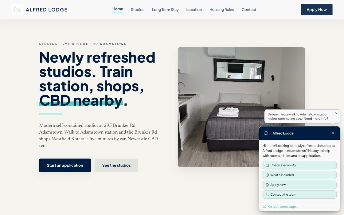
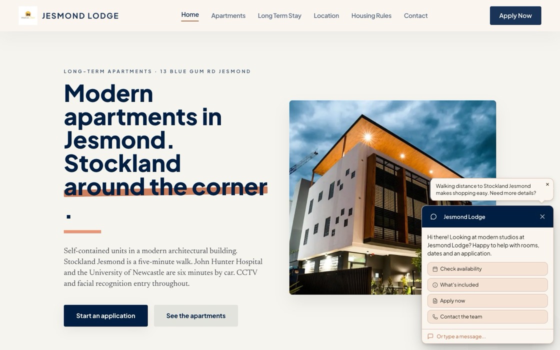
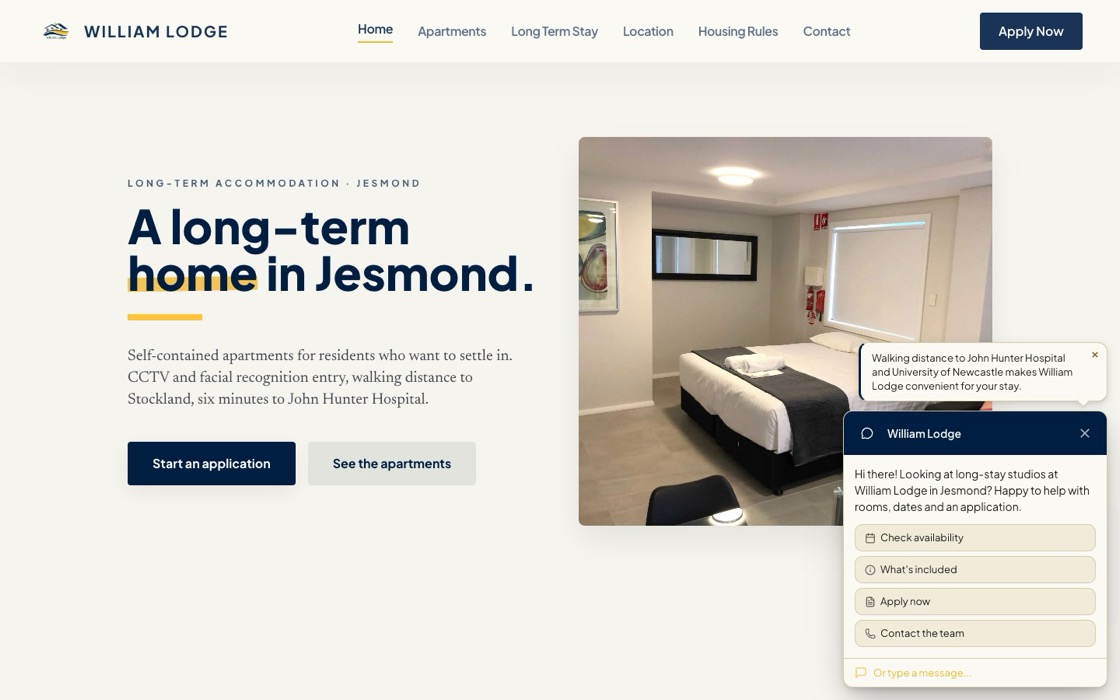
Alfred Lodge, Jesmond Lodge and William Lodge are three Newcastle accommodation sites we built for Tony Hughes of Newcastle Apartments as an intentional set. Same shape, same approach to local specifics, similar visual rhythm across all three. Built affordably with limited input from me. Tony brought the local knowledge: the audience segmentation, the security messaging, the genuine "six minutes from John Hunter Hospital" detail. We let those specifics drive the build instead of pulling toward a generic accommodation template.
All three run our L2chat chatbot for guest enquiries, and the contact form is the L2chat form too. One tool, both jobs. And the performance is the part I'm proudest of: Alfred Lodge clocks a GTmetrix Grade A with 99% performance and a 1.6 second fully loaded time, 24 requests total.
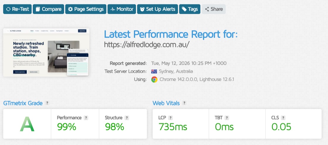
Not easy to hit on WordPress without stripping the design back.
Three sites, one style-set, real content end to end.
Away from the keyboard
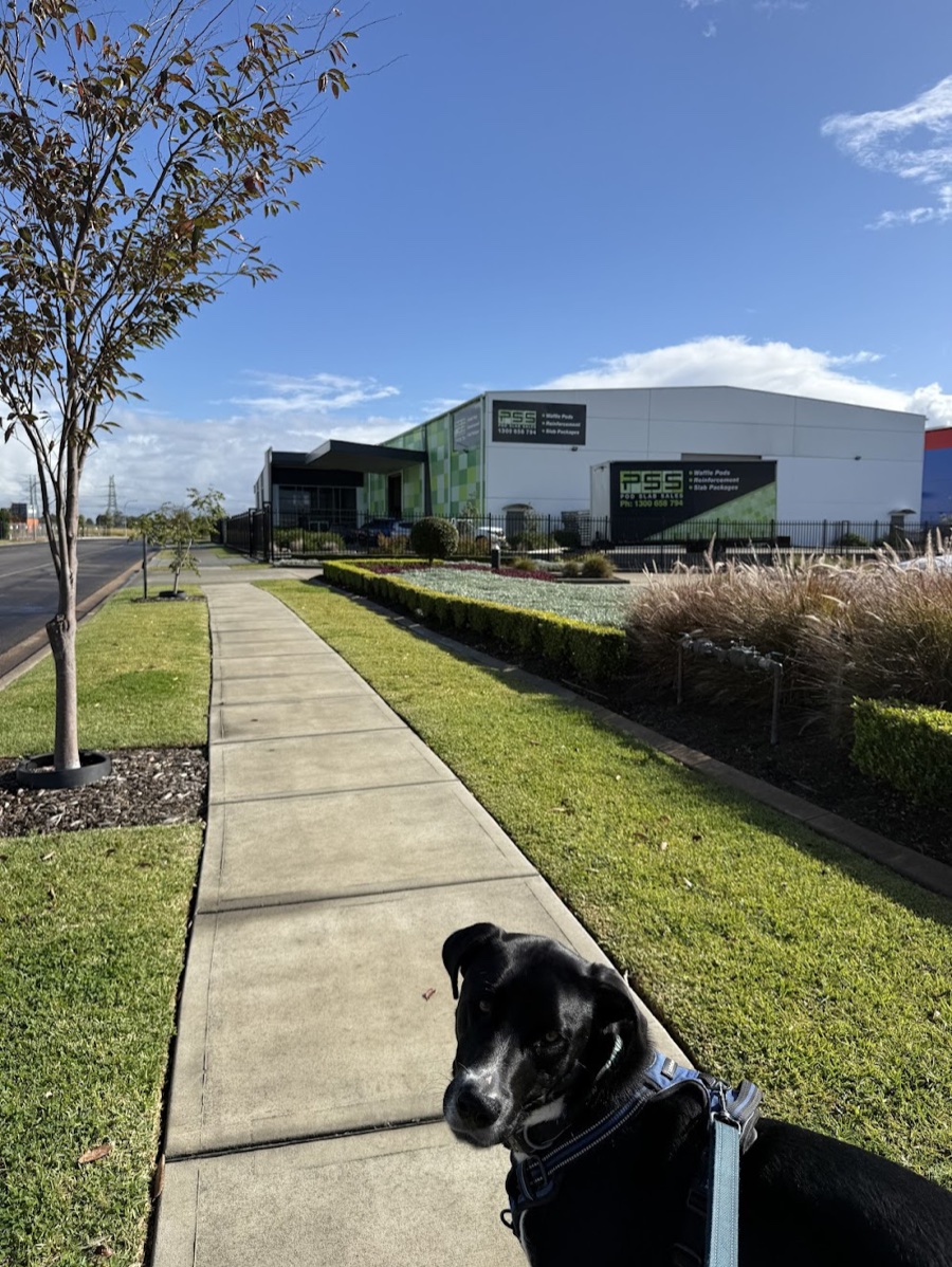
Panda came on a client visit with me recently. We were there to find out what the business actually does and where a web app or AI tool might help. Panda isn't into context-gathering, but he likes getting out and getting pats. If I'm coming to your office for a meeting and you're happy to have Panda along, just let me know.
If someone you know would get something out of this, feel free to forward it. And just reply if you want to chat, I read every one.